Case Study · Mrig AI · Mobile
Mrig AI, a virtual try-on for every marketplace.
An iOS & Android app. Upload your photo, pick a marketplace, see how clothes will look before you buy. Co-built with Aniket Khandelwal. Live on App Store and Play Store. 200+ downloads in three days.
- Role
- Designer · co-builder
- Team
- Vidhan + Aniket
- Platform
- iOS · Android · Swift
- Tools
- Stitch · Claude · Figma
What it does
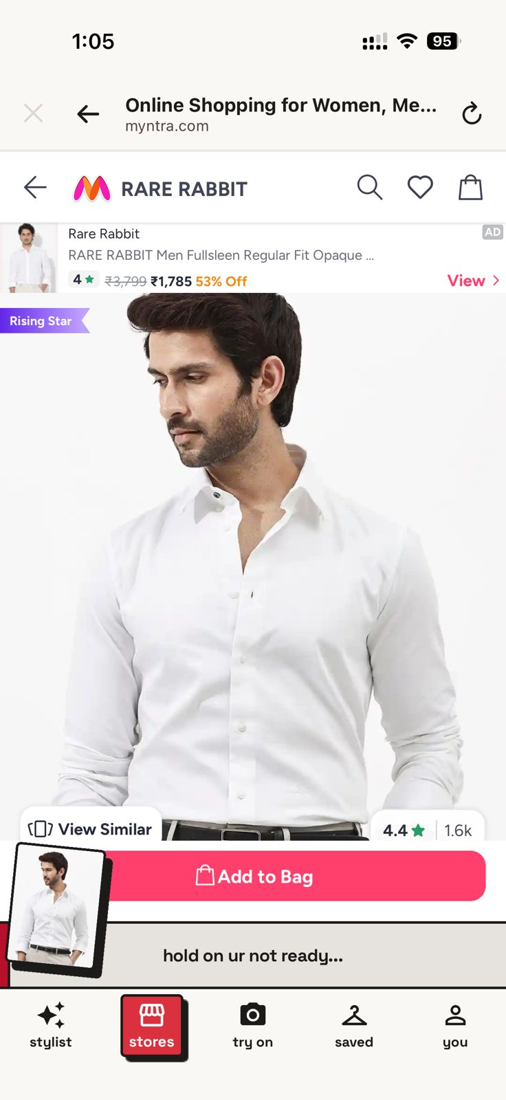
Upload your photo. Pick Myntra, Zara, H&M, or Amazon. Try anything on virtually before buying. Mrig means deer in Sanskrit, we wanted the brand to feel Indian, contemporary, a little playful.
The problem
Young shoppers buy, wait, try, return. Existing try-on tools work inside one brand's app (Zara's only shows Zara) or rely on clunky webcam features that don't survive real shopping behaviour. We wanted one app, every marketplace, your photo, instant try-on.
“If AI could solve one problem in your daily life, what would it be?”
Clothing came up loudest, visual, intuitive, instantly testable on day one. That picked the first app for an AI umbrella Aniket and I had been planning.
Designing in 8 days
Two days on concept and references. Six on design iteration. Engineering ran in parallel. The eight days is design time, not the full build.
Stitch + Claude workflow
- I used Claude to write Stitch prompts, feeding it references, having it draft prompts, iterating until the output was close.
- Stitch got us 70%. Figma did the 30% that matters most: interaction detail, edge states, brand voice.
- Aniket used Claude for Swift, model selection (Gemini won for image outputs), and debugging.
Flow
The product
Onboarding
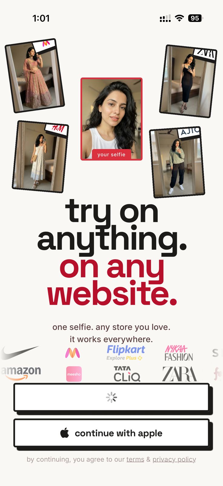
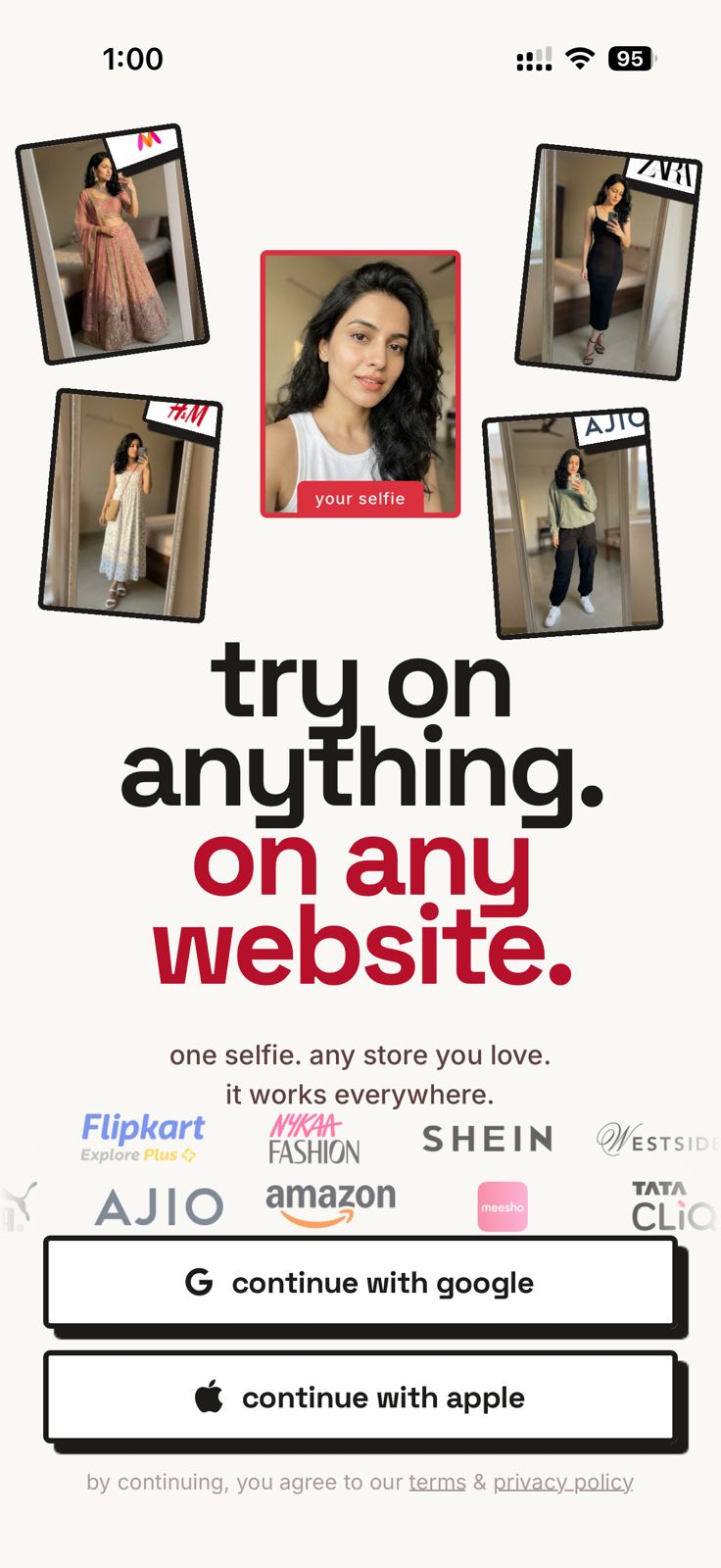
Two screens, then Firebase Auth. Value first, then the ask.
Photo upload
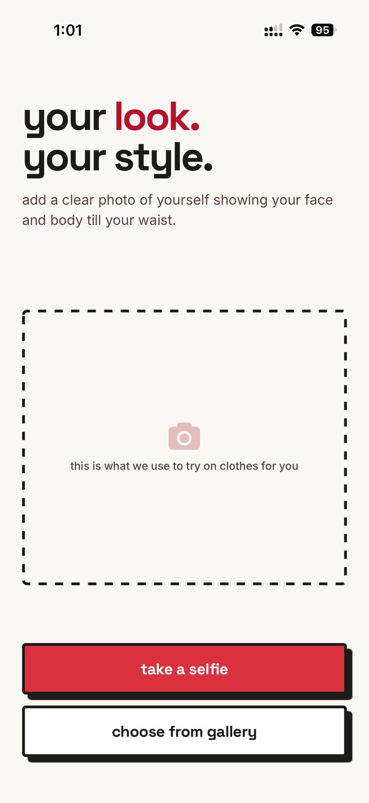
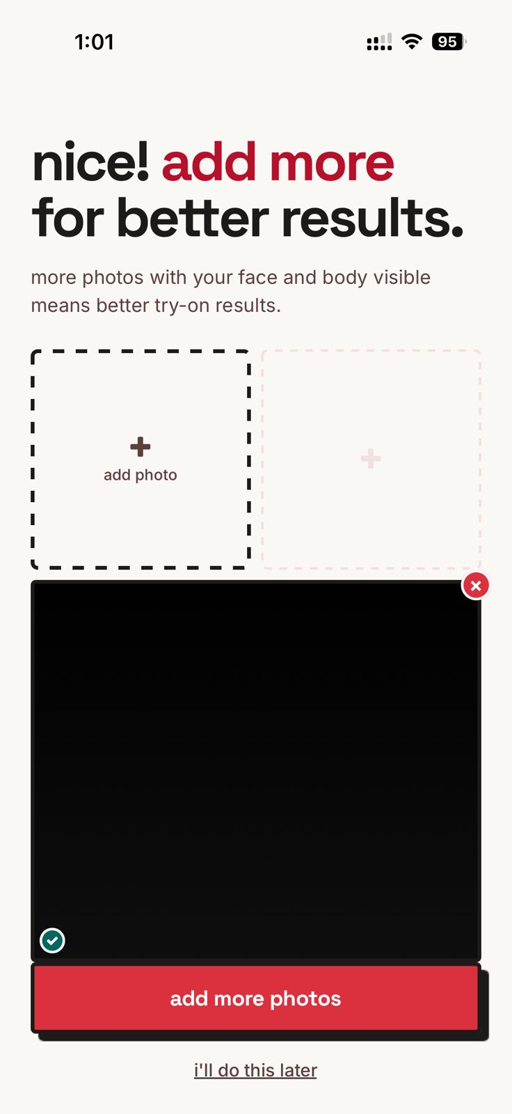
The most sensitive moment. Lead with the trust statement , we won't misuse your photo, then guide on close-up, half, full body. Multiple uploads suggested. Stored safely on the backend.
Home + marketplace
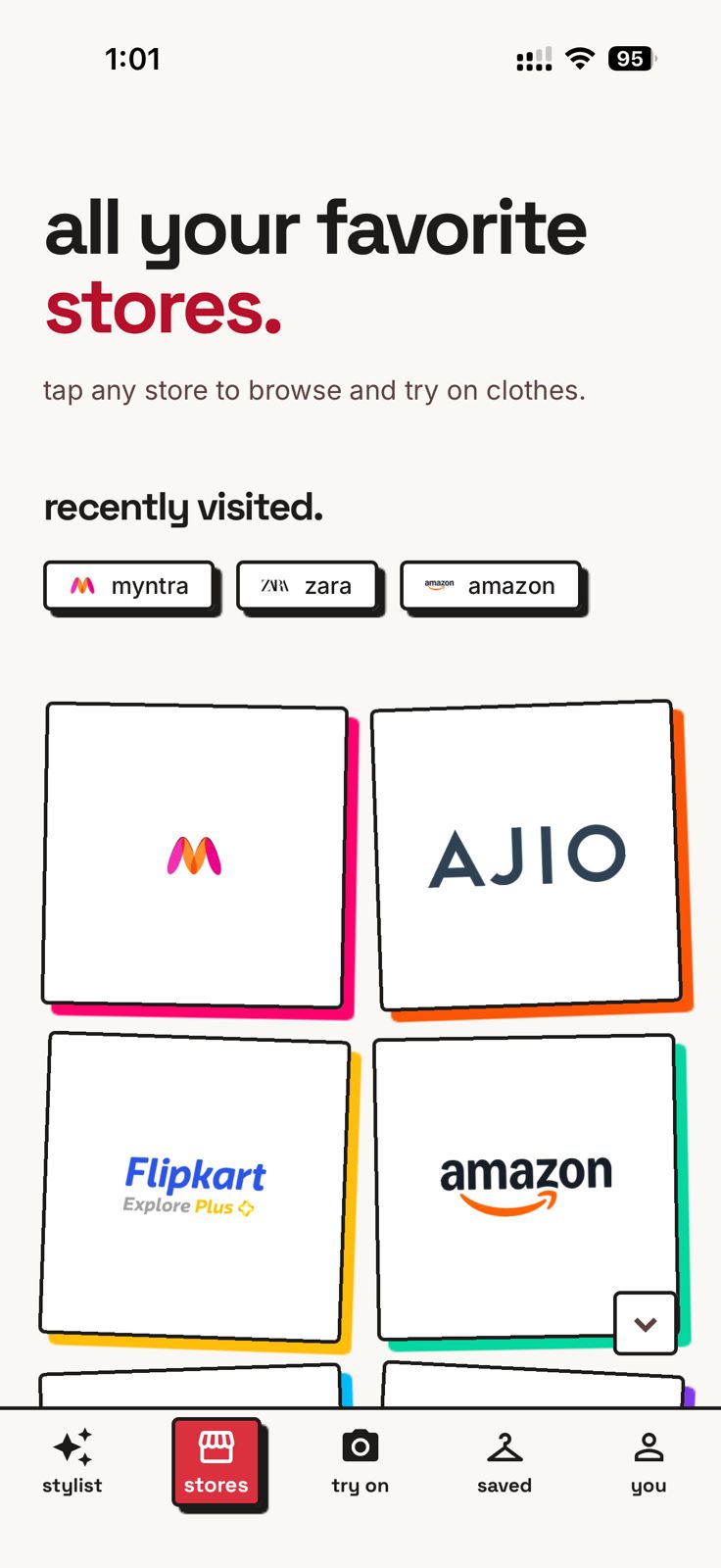
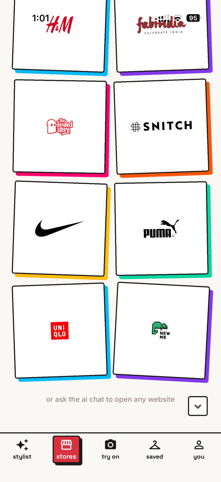
Pick a marketplace. It opens in an in-app webview so users browse the real catalogue without leaving Mrig.
Try-on
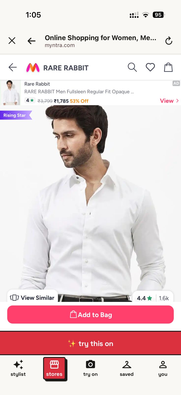
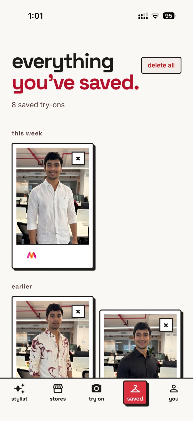
One tap from any product. Gemini occasionally hallucinates, we surface that honestly rather than overpromise.
Chat + photos
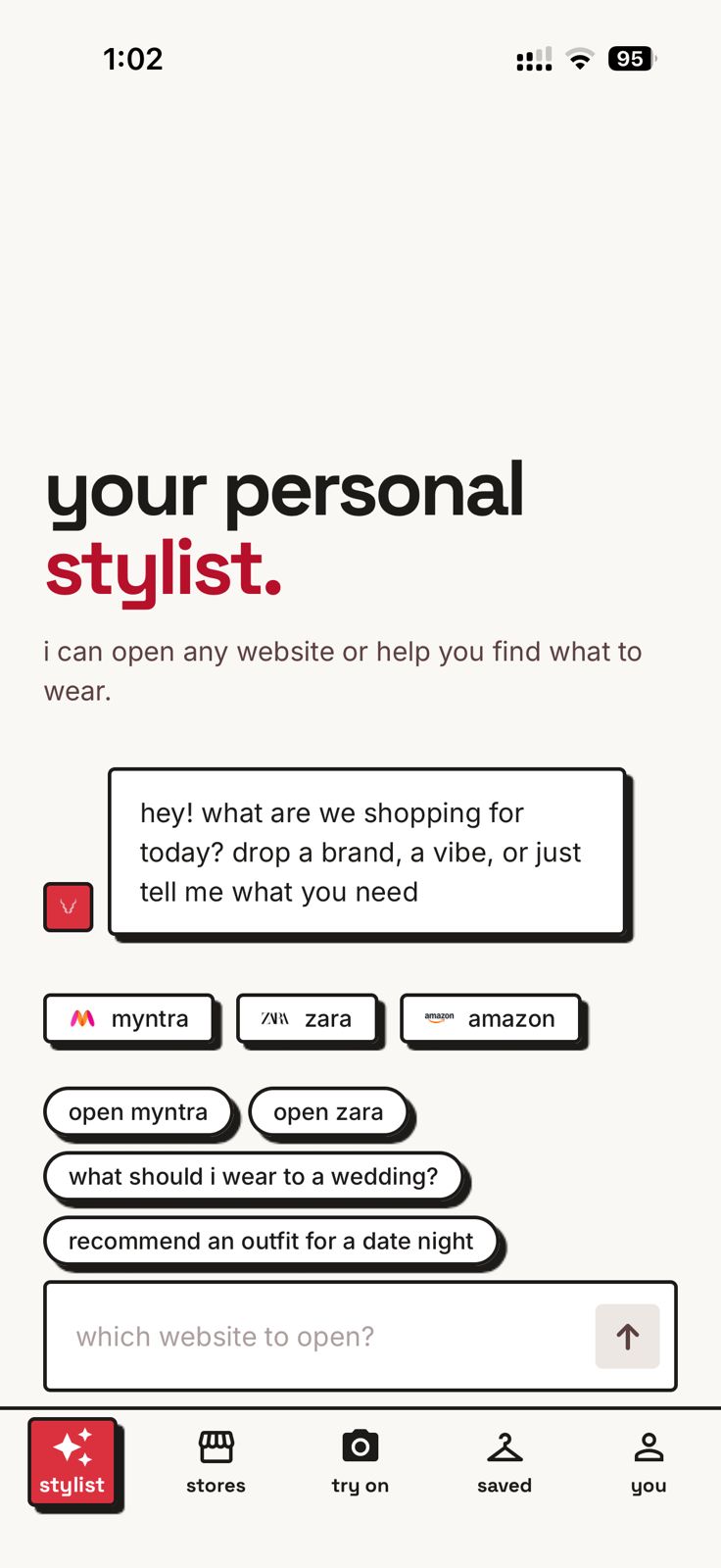
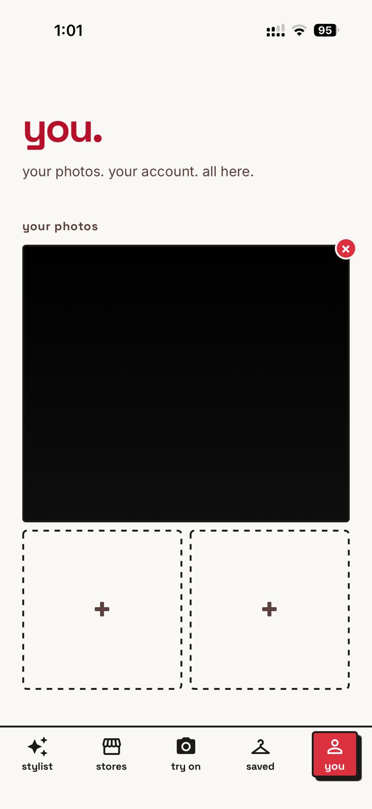
Ask the assistant for style help. Swap which photo drives the try-on without re-uploading.
Identity
White deer on red. Sanskrit name, Indian energy, a little quirky. The interior of the app stays quiet so the brand can breathe at the edges.
Minimal vs. fancy
The longest debate Aniket and I had. I wanted minimal. He wanted fancy. We built both in Figma and held them side-by-side until the answer was obvious: mostly-minimal with a few deliberately quirky moments. Pure minimal would have read generic. Pure fancy would have buried the function.
Generalised lesson: in a two-person team, design debates resolve faster when you build both options visibly instead of arguing in the abstract.
Launch
- 200+ downloads in three days across both stores.
- App Store review took multiple rounds, a crash course in consent, content review, and image-use policies.
- Gemini's hallucinations are real. We surface that, we don't hide it, and we keep tuning.
Reflection
“Building isn't just about AI and using it, learning how end users react is more important.”
The model isn't the product. The pipeline isn't the product. What happens when a real person opens the app for the first time is the product. You can design in eight days. You have to listen for months.
What's next
Aniket and I are building the next app under the same umbrella. Mrig stays live.