Plivo · CX Platform
Making compliance legible: rebuilding Plivo's 10DLC, Campaigns, and Compliance console
A redesign of the surfaces that Uber, Zomato, and Meta , and the Plivo FDEs supporting them, use every day to get messaging campaigns approved. The goal: turn a regulatory black box into a console anyone could read.
- Role
- Product & Visual Designer
- Company
- Plivo
- Surface
- 10DLC · Campaigns · Compliance
- Status
- Shipped to production
Context
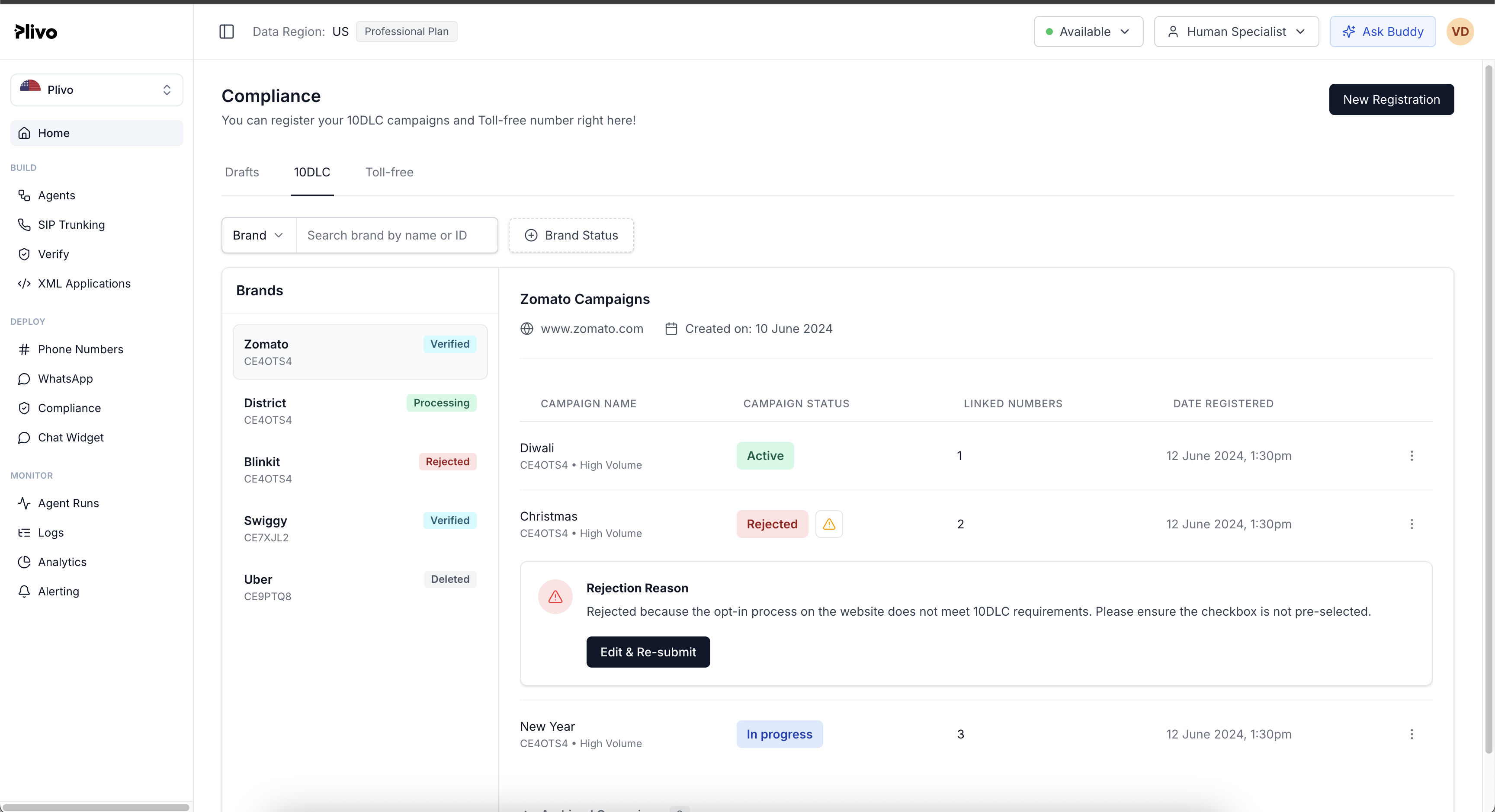
Plivo's CX platform is the dashboard customers use to manage SMS compliance, registering brands, submitting campaigns, and tracking them through the 10DLC and TCR vetting pipeline.The people on these pages aren't designers or engineers. They're PMs, CTOs, and ops leadsat brands like Uber, Zomato, and Meta, plus Voice-AI and telephony API teams. They need to understand a regulatory landscape they didn't design, and they need to act on it.
I worked across this surface with senior designers, engineering managers, PMs, and the Product Head of Messaging. The brief was wide: three pages, 10DLC registration, Campaigns, and the Compliance hub, all overdue for a rethink.
The problem
The console buried the hardest parts of the regulation behind collapsibles.When a campaign was rejected, the reason wasn't visible by default. To find it, a customer (or, more often, the Plivo FDE supporting them) had to open the right section, parse internal vetting status, and frequently fall back to pinging the messaging team or hitting the API directly to figure out at what stage the rejection happened and why.
That cascade was the real cost. Every rejection turned into multiple internal handoffs: FDE → support → messaging team → API. The Drafts experience was thin. There was no edit-and-resubmit path. There was no archive at all, customers had no way to retire old campaigns from the list. And there was no progress system telling a customer where their campaign stood in the multi-step vetting pipeline.
“The rejection reason was the single most important piece of information on the screen, and it was buried three clicks deep.”
“Every time a campaign got rejected, I had to ping the messaging team and dig through the API just to tell the customer what was wrong.”
Why now
FDE pain was the trigger. Customer-support escalations were a parallel pressure. Plivo's customer base had grown into brands that expected enterprise-grade clarity, and the console wasn't meeting that bar.
Research & framing
I studied how Twilio, Bandwidth, and Sinch surface compliance state, and noticed they all design for developers managing customers, not for the customers themselves. Plivo's redesign moved the other way. Then I sat with the Product Head of Messaging and walked the full lifecycle: a customer registers a brand, submits a campaign under it, goes through internal vetting (info cross-check, brand volume), then carrier vetting, then lands in one of three terminal states , verified, rejected with a resubmit path, or rejected outright.
The biggest reframe came from auditing who actually lands on these pages. Not regulatory specialists. Not engineers. PMs and CTOs at brands who care about getting messaging shipped, not about TCR taxonomy. That shaped the language and the hierarchy on every screen.
Old framing
- Treat the console as an internal vetting pipeline
- Hide complexity behind collapsibles so the page looks tidy
- Surface speaks the language of TCR, vetting scores, carrier APIs
- Customer should ping support when a campaign gets rejected
New framing
- Treat the console as a customer-facing compliance posture
- Surface state, especially the painful states, by default
- Surface speaks the language of brands, campaigns, next actions
- Customer should read the reason and resubmit on the same page
Design principles
- Surface state, don't hide it. No collapsibles for things people came here to read.
- Make the lifecycle visible. A customer should always know where their campaign stands and what happens next.
- Respect the limits of trust. Some signals (like internal vetting scores) stay internal, by policy. But everything a customer needs to act, they can see.
- One hub for compliance. Don't make people guess which page their problem lives on.
User flow
The diagram below shows the full campaign lifecycle , the path every customer travels from brand registration through to a verified or rejected outcome, and the recovery moves I introduced when the path turns bad. The dark nodes mark the four design additions that did the most work to remove internal handoffs.
Hover or tap any node to see what it does.
Design solution
The redesign moved through three acts: 10DLC registration, the Campaigns surface, and the systemic move, a unified Compliance hub.
Mapping the vetting flow end-to-end
I mapped the full vetting flow end to end: brand registration → campaign registration under the brand → internal vetting → carrier vetting → outcome state. Each outcome, verified, rejected, resubmit, got its own treatment with the right next action surfaced.
Where company policy permitted, I exposed both internal and carrier-level status. Where it didn't, I designed around the gap so the customer still understood what was happening to their submission, even if they couldn't see every signal feeding into it.
Killing the collapsibles
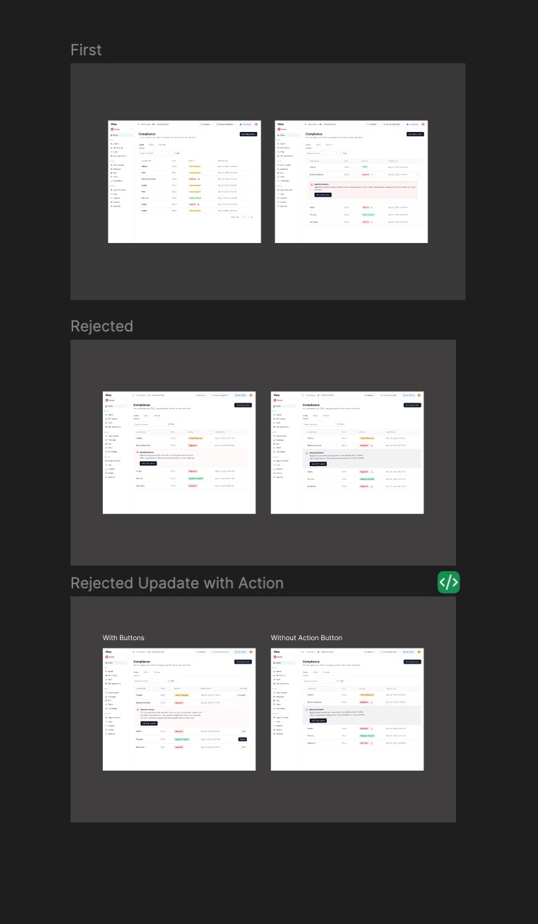
This was the heaviest lift. I reframed the page as a two-pane layout: brands on the left, their campaigns on the right. Inside each campaign card I killed the collapsibles. Rejection reasons now sit inline, directly below the campaign they apply to, viable because each brand caps at three or four campaigns, so the screen stays scannable rather than turning into a wall of text.
- A progress system spanning the campaign lifecycle, so customers can see where each submission sits.
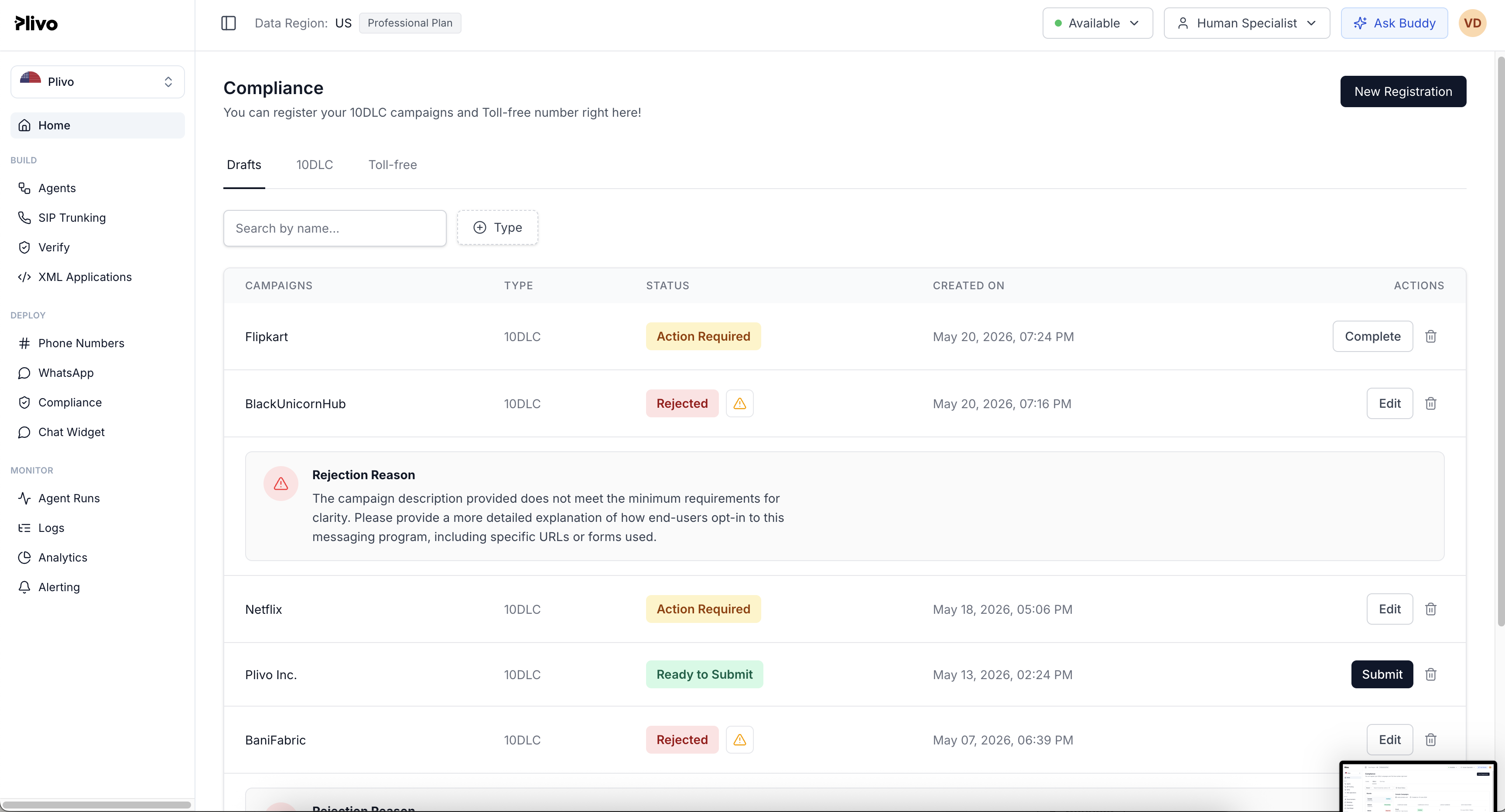
- Archive, a new action entirely. Customers previously had no way to retire old campaigns. I introduced archive as the missing terminal step, with explicit irreversibility messaging.
- Drafts page redesign , cleaner hierarchy, clearer affordances for “in progress vs. ready to submit.”
- Edit-and-resubmit for rejected campaigns. Previously customers were forced to start over; now they can fix exactly what was flagged.
The debate: how much to expose
Two trade-offs took the longest to resolve. First: should customers see internal vetting scores? Company policy said no, that data stays internal. I couldn't change the policy, but I redesigned around it so the absence didn't feel like a black box. Second: should the campaign use case be exposed to the customer? I argued yes , the use case is the most direct context a customer has for understanding the verdict on their submission. That one landed.
One page for the entire regulatory posture
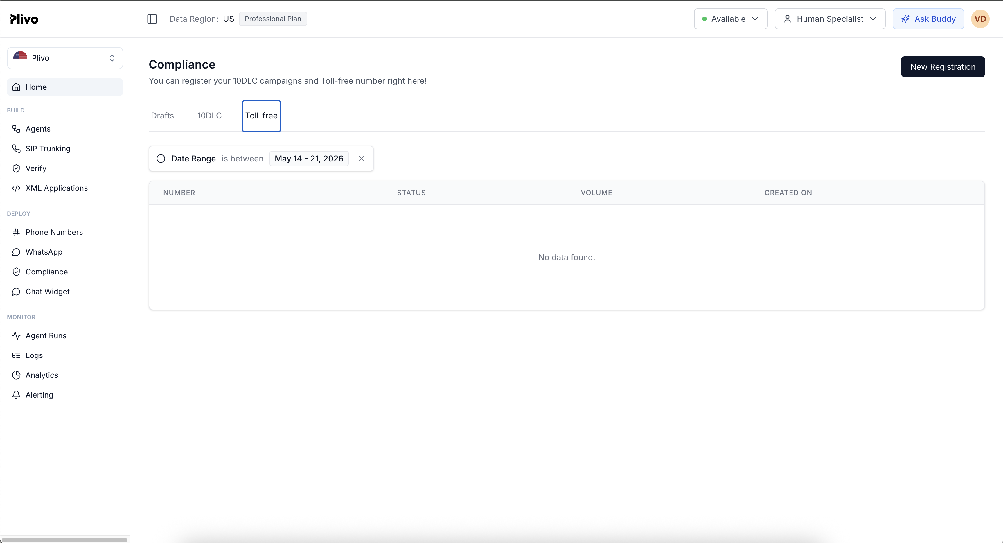
The systemic move. I unified 10DLC, Drafts, Toll-Free, and the new brand/campaign regulations under a single Compliance page. Customers no longer needed to know which regulatory framework their issue lived under, the hub held all of it, with consistent state language across each section.
This is the page I'd point to first if asked “what changed at the system level.” It's the difference between a console that reflects Plivo's internal org chart and one that reflects how a customer actually thinks about their compliance posture.
Process & iteration
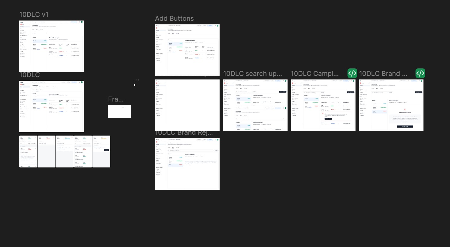
Three to four iteration rounds per surface with design and PM feedback before the work settled. The Figma file ended up split by surface, 10DLC, Draft Page Updates, Archive Popup, Research Addons, so each surface had its own tracked exploration history rather than getting buried in a single sprawling page.
Once the visuals were locked, I prototyped the final flows in code (working with Claude) so the handoff to engineering was a buildable spec, not a static file.That meant fewer rounds of “what did you mean here?” with dev, and the build closed faster than the previous campaigns redesigns had.
Impact
- Support tickets dropped. Customers stopped opening tickets just to ask why a campaign was rejected, the answer was on the screen.
- FDE cascade collapsed. FDEs stopped routing rejection questions through the messaging team.
- Positive direct feedback from brands , they said the console finally made the regulatory landscape legible.
- All three surfaces shipped. 10DLC, Campaigns, and Compliance are live in production.
Reflection
If I did this again, I'd spend more time estimating the problem before exploring solutions. The first two iterations on Campaigns were spent narrowing what the problem actually was, and in hindsight, a sharper framing up front would have gotten me to the two-pane layout in one round, not three. The lesson generalized for me: in regulated, multi-stakeholder products, time invested in problem framing compounds. Time spent iterating on the wrong frame doesn't.